Mastering Data Visualization: Best Practices, Tools, and Mistakes to Avoid
Last Updated : 18 Mar, 2024
 1.29L
1.29L

Introduction
In today’s data-driven world, the ability to effectively communicate insights from data is invaluable. Data visualization serves as a powerful tool in this regard, allowing analysts and decision-makers to grasp complex information quickly and make informed choices.
In this article, we’ll delve into the significance of data visualization, the best practices, and common mistakes to avoid.
Overview
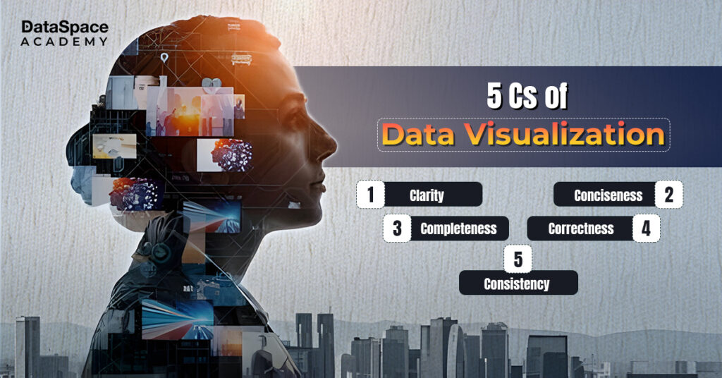
Data visualization revolves around the concept of presenting data in a graphical or visual format, making it easier to comprehend and identify patterns. The 5Cs of data visualization – Clarity, Conciseness, Consistency, Correctness, and Completeness – serve as guiding principles for creating effective visualisations. These principles ensure that visualization techniques are both informative and engaging, enabling stakeholders to extract actionable insights effortlessly.
-
Clarity: The visualisation should be clear and easy to understand, avoiding clutter and unnecessary complexity. It should effectively communicate the intended message with clarity.
Conciseness: Information should be presented briefly, focusing on the key insights or messages without overwhelming the audience with excessive data or detail.
Completeness: The visualisation should provide a comprehensive view of the data, ensuring that all relevant aspects are covered. A perfect visualisation dashboard should facilitate a thorough understanding of the information being conveyed.
Correctness: Accuracy is crucial in data visualization. The data should be accurately represented without distortion or misinterpretation. Any analysis or conclusions drawn from the visualisation should be based on reliable and accurate data.
Consistency: Visual elements such as colours, scales, labels, and formatting should be consistent throughout the interactive data visualization. This is to avoid confusion and make it easier for the audience to interpret the information. Consistency also applies to the use of visualisation techniques and design principles across different parts of the visualisation dashboard.
Significance of Data Visualization
Data visualisation plays a pivotal role in various domains, including business intelligence, data analysis, and decision-making. By translating raw data into intuitive charts, graphs, and dashboards, organisations can uncover hidden trends, identify outliers, and communicate findings more effectively. Furthermore, visualisations facilitate collaboration and knowledge-sharing, empowering teams to align their efforts towards common goals.
Best Practices to follow
Here are some tips and tricks to optimise the effectiveness of your visualisation dashboard:
-
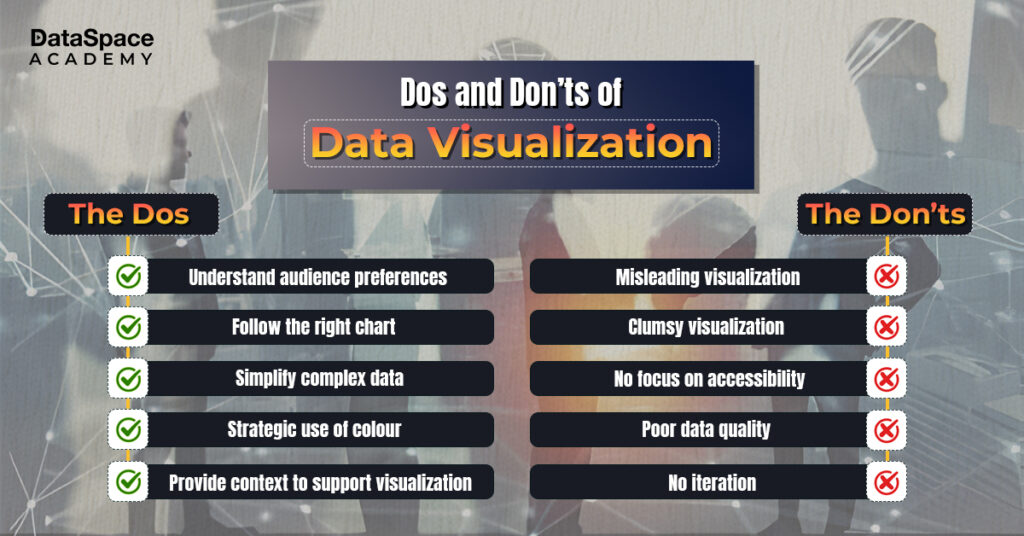
Know your audience:
-
Choose the right chart type:
-
Simplify complex information:
-
Utilise colour strategically:
-
Provide context:
-
Embrace interactivity:
Tailor visualisations to the preferences and expertise of your audience, ensuring they can easily interpret the data.
Select the most appropriate chart or graph based on the nature of your data and the insights you wish to convey.
Avoid clutter and unnecessary elements, focusing on key metrics and trends to maintain clarity.
Use colour to highlight important information and create a visual hierarchy, but avoid excessive use that may confuse or distract.
Supplement visualizations with annotations, captions, and labels to provide context and guide interpretation.
Leverage interactive features to allow users to explore data dynamically and gain deeper insights.
Top Tools for Data Visualization
Several tools empower users to create compelling visualizations effortlessly. One standout option is Microsoft Power BI, a renowned business analytics platform. Power BI offers a user-friendly interface, trendy visualisation features, and advanced visualisation capabilities, making it ideal for both beginners and seasoned analysts. With Power BI, users can visualise data from various sources, create interactive dashboards, and share insights across the organization seamlessly. Sign up with our power bi training online to master Power BI for advanced data visualisation.
Apart from Microsoft Power BI, there are several other important data visualization tools that make the process time and money-worthy. Here’s discussing a few of them.
- Ubiq: A cloud-based alternative to Power BI that can help self-service data exploration without coding or SQL.
- Holistics.io: It is a powerful, cloud-based alternative to Power BI. The tool enables data experts to explain reusable models, enabling business users to ask questions without SQL.
Mistakes to Avoid
While data visualisation can be a powerful tool, certain pitfalls can undermine its effectiveness. Below is a list of mistakes that every analyst should be aware of while creating visualisations.
- Misleading visualizations:
- Overly complex designs:
- Ignoring accessibility:
- Neglecting data quality:
- Failing to iterate:
Avoid distorting or misrepresenting data through misleading visualisations, as this can lead to erroneous conclusions.
Strive for simplicity in your visualisations, avoiding unnecessary complexity that may confuse or overwhelm users.
Ensure that visualizations are accessible to all users, including those with visual impairments, by adhering to accessibility guidelines.
Validate and clean your data before creating visualizations to prevent inaccuracies or biases from compromising the integrity of your analysis.
Continuously refine and iterate your visualisations based on feedback and evolving requirements, ensuring they remain relevant and impactful over time.
Conclusion
To sum up, mastering data visualization requires a combination of technical expertise, creativity, and strategic thinking. By adhering to best practices and avoiding common mistakes, organisations can unlock the full potential of their data and drive informed decision-making. As the volume and complexity of data continue to grow, effective data visualization will remain a critical skill for professionals across industries.
 1.29L
1.29L


